Antionette Zalewski Architectes

Named after its founder, Antoinette Zalewski Architectes is a boutique architectural and interior design practice based in Paris. Continually growing as a company, they approached us to create a new brand that felt modern and elevated and would connect with the high-end services they offer.
Services
Logo
Visual identity
Art direction
Brand guidelines
Print

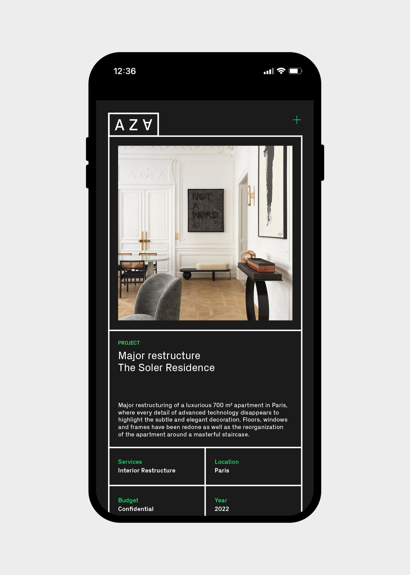
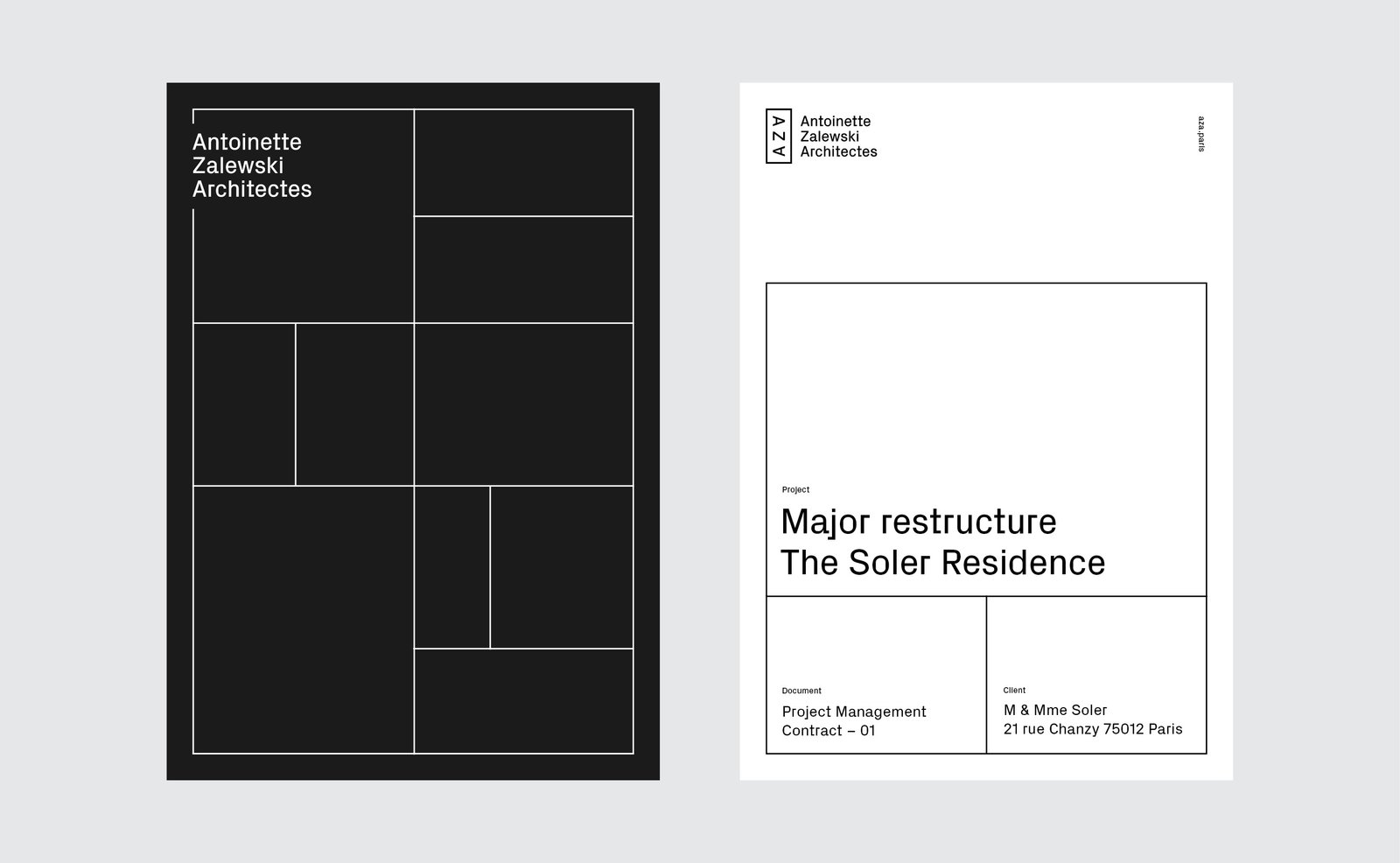
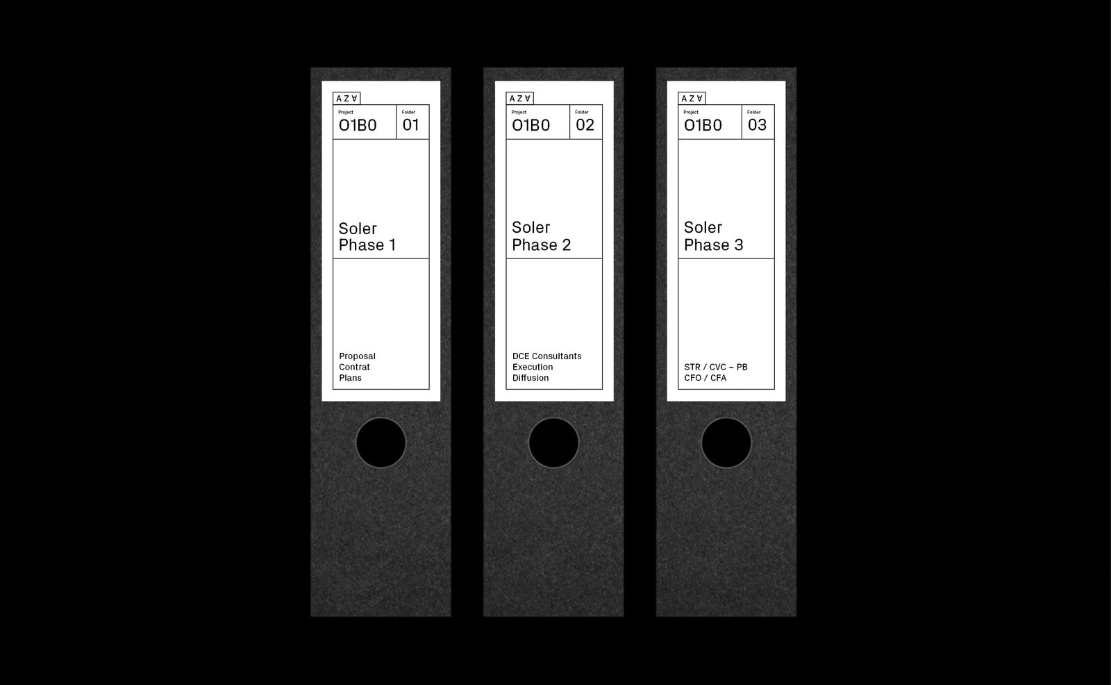
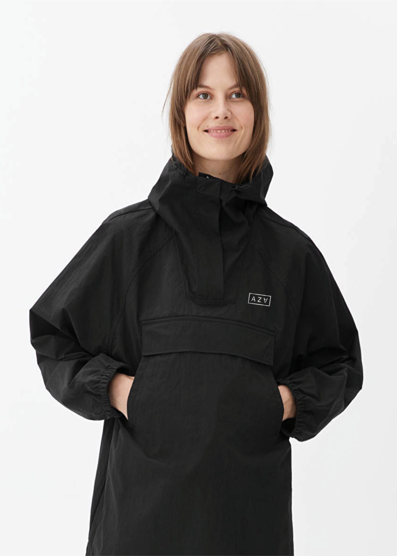
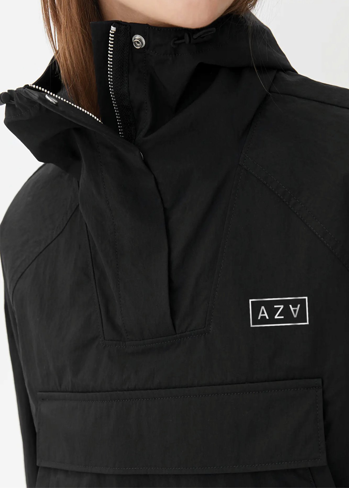
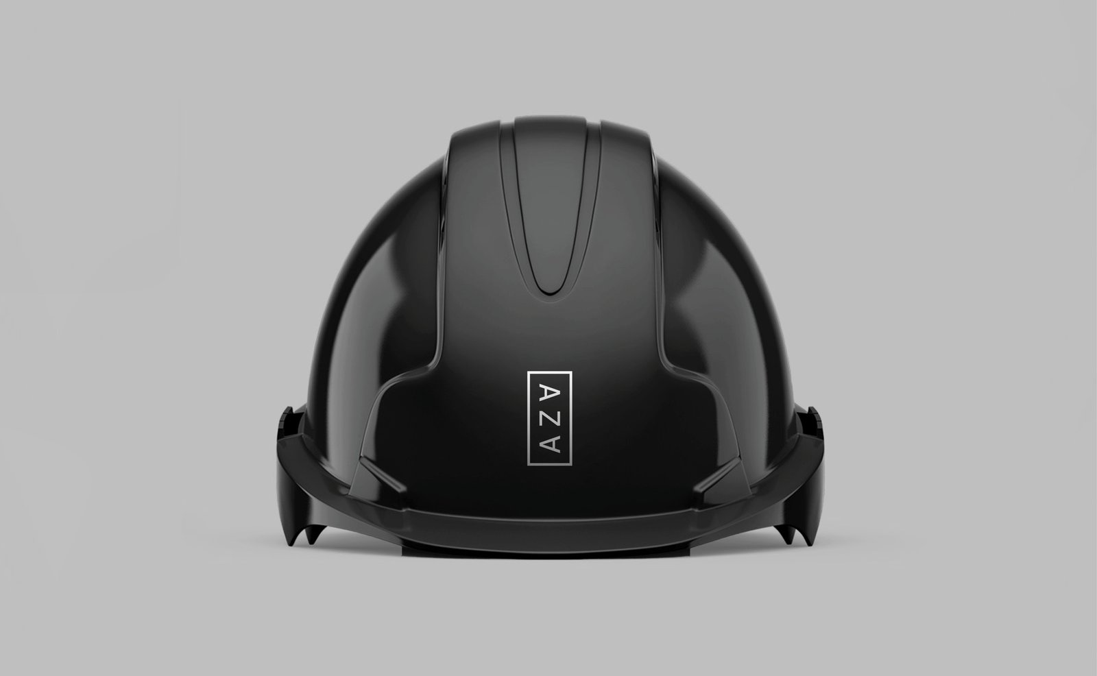
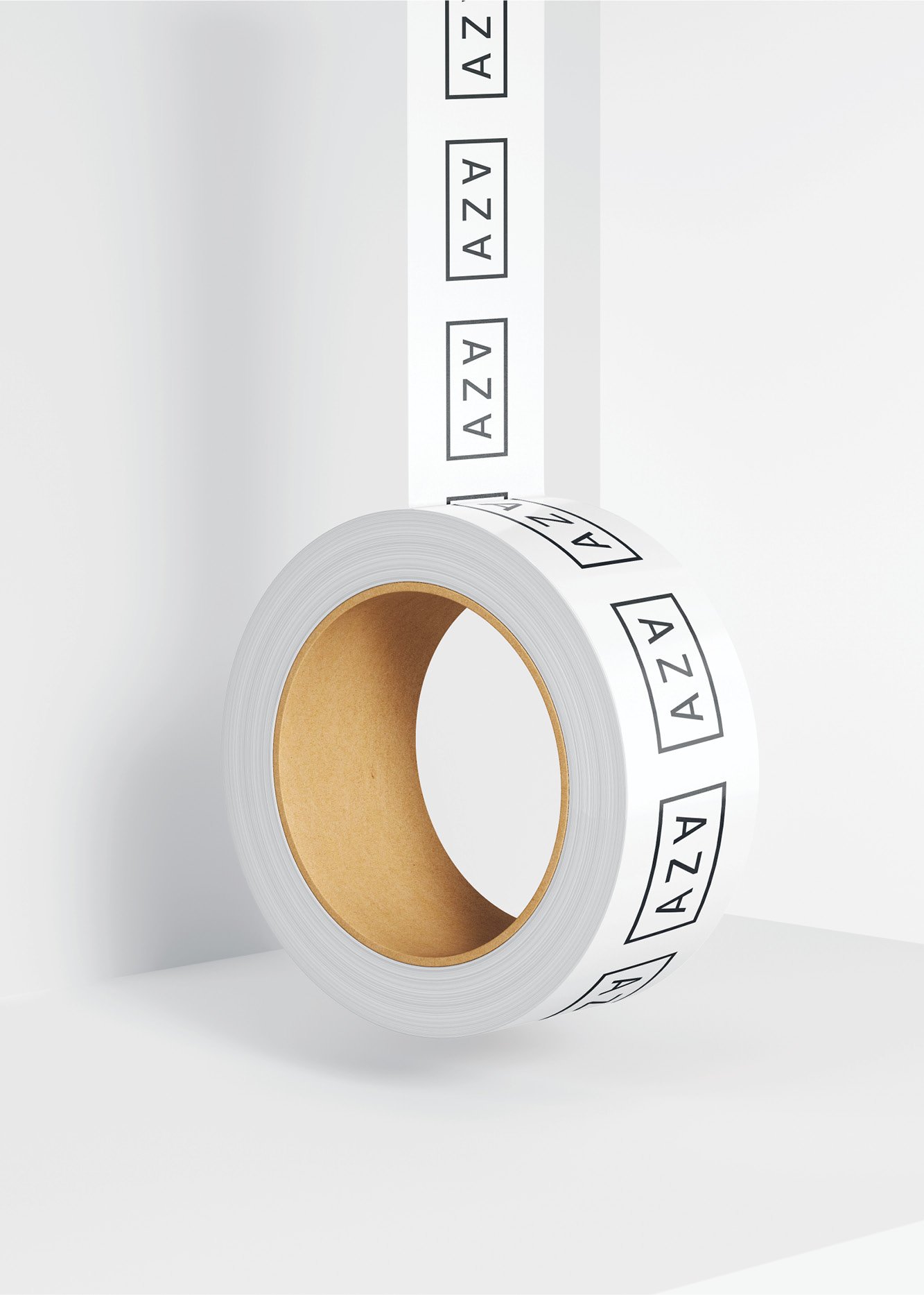
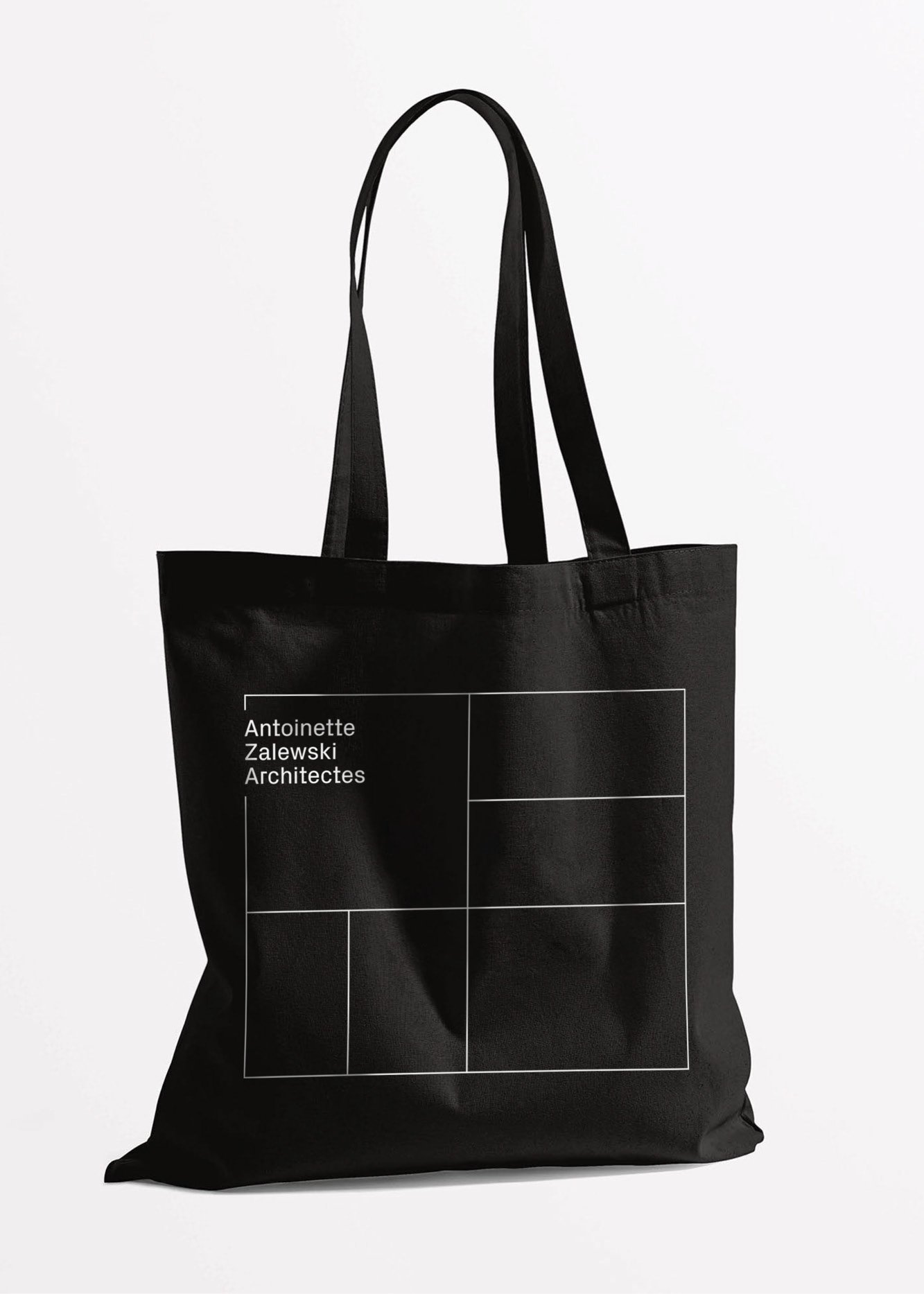
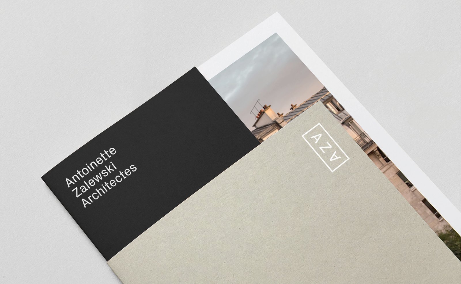
We created a bold identity based on the idea of activating space. The logo references this idea by exploiting the geometric structures of the letterforms AZA to create a playful, graphic acronym that functions vertically and horizontally. The logo was then extended into an identity system featuring a responsive framing device used to signpost zones of content across all touchpoints.
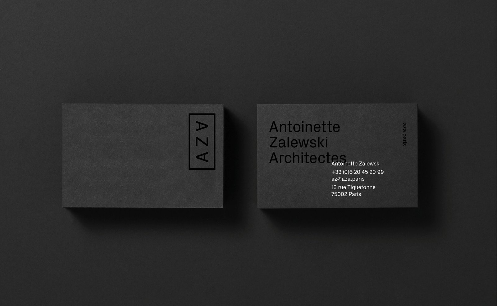

We developed brand guidelines that included typographic and layout principles. Px Grotesk features as the principal typeface of the new identity, its square features echo the geometric nature of the acronym and continues the structural theme. The result is a minimally impactful identity, allowing the brand to communicate their expertise through an elevated lens.


Project realised with team Graphéine
Art Direction — Jeremie Fesson, Sarah Magro
Design Development — Sarah Magro
Project Management — Leslie Darné
Antoinette Zalewski Architectes
Named after its founder, Antoinette Zalewski Architectes is a boutique architectural and interior design practice based in Paris. Continually growing as a company, they approached us to create a new brand that felt modern and elevated and would connect with the high-end services they offer.

Services
Logo
Visual identity
Art direction
Brand guidelines
Print

We created a bold identity based on the idea of activating space. The logo references this idea by exploiting the geometric structures of the letterforms AZA to create a playful, graphic acronym that functions vertically and horizontally. The logo was then extended into an identity system featuring a responsive framing device used to signpost zones of content across all touchpoints.


We developed brand guidelines that included typographic and layout principles. Px Grotesk features as the principal typeface of the new identity, its square features echo the geometric nature of the acronym and continues the structural theme. The result is a minimally impactful identity, allowing the brand to communicate their expertise through an elevated lens.


Project realised with team Graphéine
Art Direction — Jeremie Fesson, Sarah Magro
Design Development — Sarah Magro
Project Management — Leslie Darné
Get in touch
Whether you’re looking to create a new brand or update an established one, I can help it be more remarkable at every touch point. Let's talk.
© Sarah Magro 2024
Get in touch
Whether you’re looking to create a new brand or update an established one, I can help it be more remarkable at every touch point. Let's talk.
© Sarah Magro 2024